Applies to: Skypetime based on-premises Skype for Business Server, Skypetime based on Active Directory, Skypetime based on Skype for Business Server Online
Available for: User, Supervisor, Manager, Administrator
From the Dashboard, user can get acquainted with the basic reports on his own work schedule, create a request (application) for leave, sick leave, business trip or time off, change the interface settings (language, date/time format), and edit the location of the info panels.
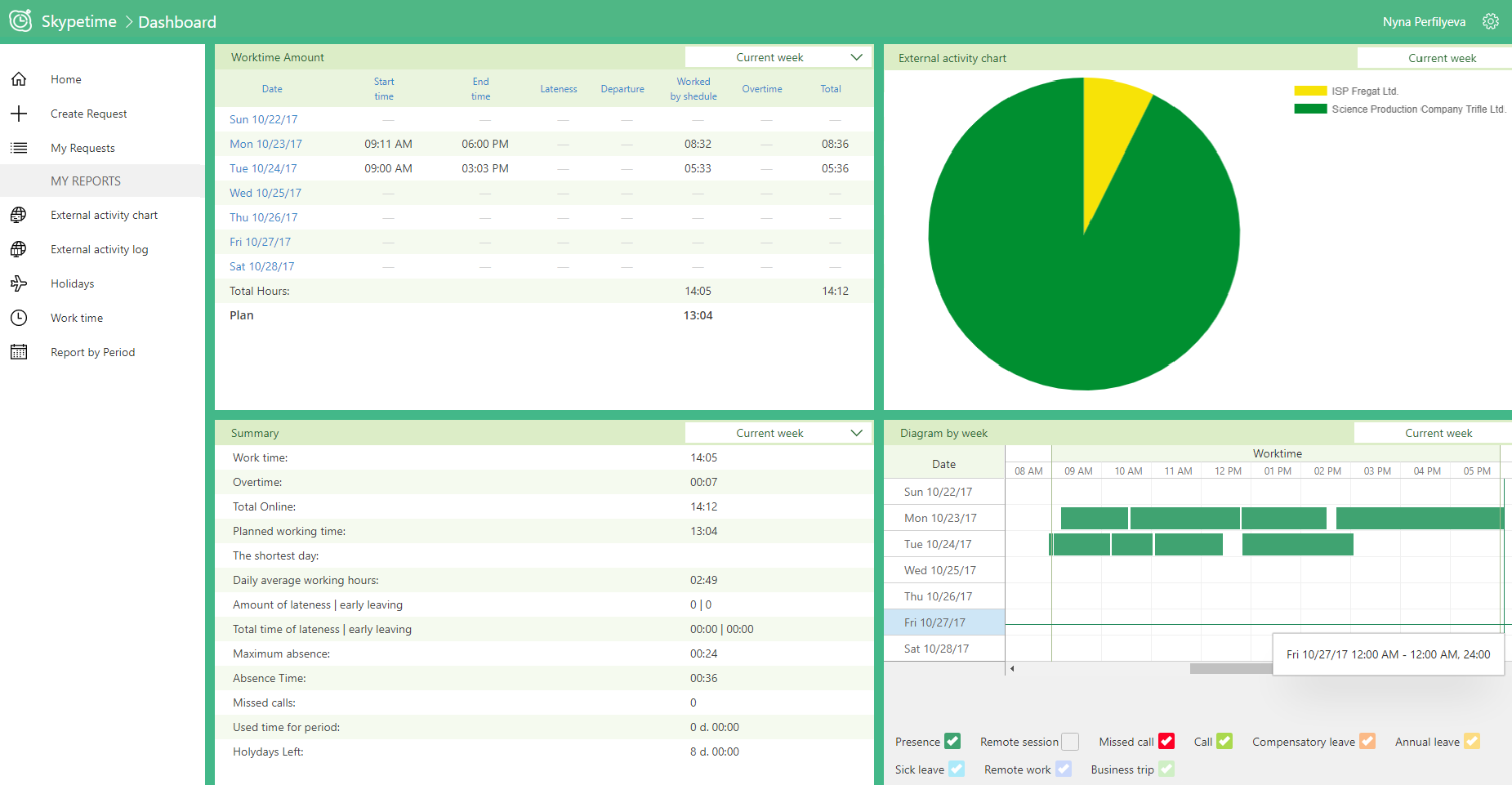
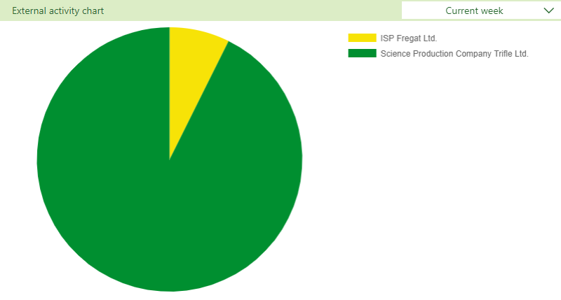
Four information panels display data on the working time for the current week in two forms: the Gantt chart and tables, applications for leave, the pie chart of external connections by providers.
To change the layout of the panels, go to the “Edit Dashboard” page.
Edit Dashboard
For more convenient perception of various data in the personal account, user can change the location of the blocks. For changes, the mouse pointer should be directed to the settings icon in the upper right corner and select the “Edit Dashboard” item.
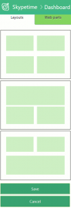 After clicking, on the left side of the screen, there will appear 2 tabs: Templates and Web Parts.
Choose the location template that is most convenient for you and go to the next tab.
You will be offered a list of different panels:
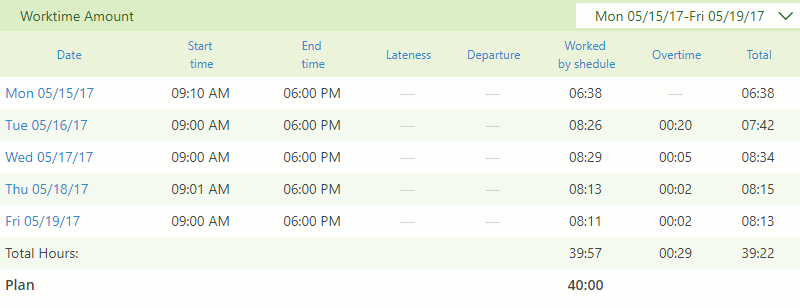
Worktime Amount
A dashboard that displays the start and the end of the workday, lateness and early departure from work, the amount of time spent and overtimes. By default, data is presented for the current week.
Requested Leaves
This dashboard is a list of all your applications for holidays / day off / sick leave for the year.

Summary
A web part that displays totals for the week, such as:
- Worktime
- Overtime
- Total Online
- Planned working time
- The shortest day
- Daily average working day
- Amount of lateness | early leaving
- Total time of lateness | early leaving
- Maximum absence
- Absence Time
- Missed calls
- Used time for period
- Holidays Left
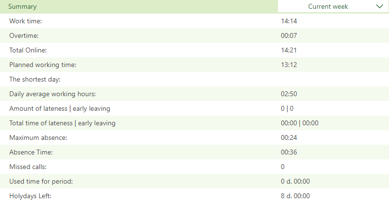
Diagram by week
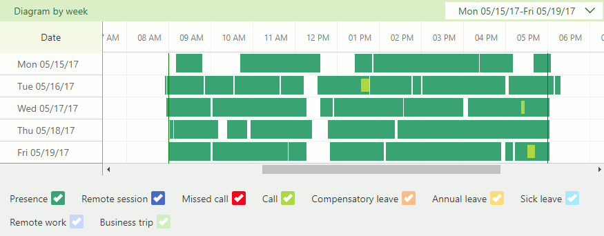
This web panel is represented as a Gantt chart. This allows you to visualize the data. The list of days is on the left on the vertical axis, and the time scale is on top horizontally. Each activity in the system is represented by a particular color stripe (view diagram legend) and length represents the duration of work. In fact, the Gantt chart allows you to visually show how long the employee was working and when he was absent.
 The dashboard will be located at the selected location and adjust to the resolution of your screen. Having filled all the necessary empty places, you should save the changes.
Additionally, user can create request or go to reports.

